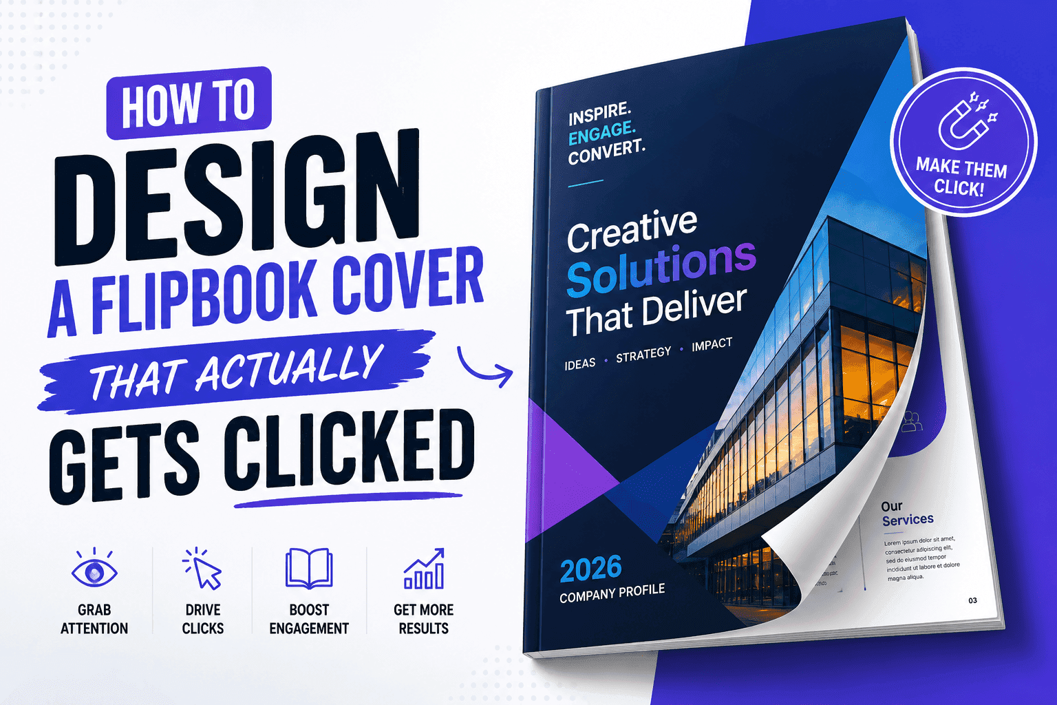
After a decade of staring at flipbook analytics, I'll give you the brutal truth: your cover does 90% of the selling before anyone flips a single page. Someone lands on a link, sees a thumbnail or a static preview, and in about a second and a half decides whether this is worth their time. That's it. That's the whole pitch. And yet I still see covers that are just a scanned title page ripped straight from the original PDF, dumped in as-is, with zero thought given to the fact that it's now competing for attention on a screen instead of sitting in a rack at a trade show.
"Make it look nice" is useless. That's just your boss shrugging at you. We need rules, not vibes.
The cover is a thumbnail first, a page second
Before your cover is ever a full-bleed page someone flips through, it's a tiny rectangle in a preview window, an email embed, or a shared link on someone's phone. This changes everything about how you should design it. Text that reads fine at full size turns into an unreadable smudge at 200 pixels wide. A background photo that looks moody and expensive in print can just look like a dark gray square in a thumbnail.
So the first rule I give people is: design for the smallest version first, then scale up. Pick one focal point. One product shot, one bold headline, one clear visual anchor that survives being shrunk down to postage-stamp size. If you can't tell what the cover is about at thumbnail size, nobody clicking through a list of ten links is going to bother finding out at full size.
Contrast does more work than color choice
People obsess over brand colors when designing a cover, and I get why, brand guidelines exist for a reason. But contrast matters more than which exact shade of blue you picked. A cover with low contrast between the text and the background photo will vanish into visual noise the second it's sitting next to five other thumbnails on a landing page or an inbox preview.
Run this test: squint at your cover, or better, shrink it down and view it from across the room on your phone. If the title disappears, so will your click-through rate. It's not fun. It's not sexy. But it beats picking fonts that nobody's going to read anyway.
Turn Your PDFs into Lead Generation Machines
Start getting highly-qualified leads from your PDFs and landing pages today. It takes exactly 2 minutes to set up.
No credit card required • Sign up in 10 seconds
Typography: fewer choices, bigger commitment
I've reviewed a lot of catalog covers built by well-meaning small business owners who treat the title like it needs three fonts to feel important. It doesn't. Rule of thumb: one font for the headline, one for the body. That's it. And make the headline stupid big. Borderline aggressive. If it looks "safe" on your 27-inch monitor, it's invisible on a phone. Most people undersize their titles because it feels safer, more restrained, more professional. On a screen, restrained just reads as forgettable.
If your catalog is aimed at contractors, real estate clients, or anyone browsing on a phone between jobs, this matters even more. Nobody is going to lean in and squint at your beautifully understated 24-point serif font while standing in a parking lot. Give them something they can read from three feet away without trying.
Stop grabbing random icons off Google
A lot of covers fall apart here, not from bad taste but from bad logistics. You've got the headline sorted, you've got a product photo, but you need a small supporting element, an icon indicating "new," a little graphic marker showing a category, a simple visual cue that breaks up a wall of text. And you don't have a designer on call to whip one up in twenty minutes.
Most people either grab something off Google Images that's the wrong resolution and vaguely watermarked, or they give up and leave the cover flatter than it needs to be. Neither's a good option. What I actually do is grab a free icon set from IcoSix, since it's stocked with clean SVG vectors and icons that don't come with the usual licensing headache, and I can drop them straight into a cover mockup without worrying about resolution loss when I scale them up or down. Vector icons in particular are worth the extra five minutes of hunting for the right one, because they stay crisp whether your cover is a thumbnail or a full-bleed print-ready file.
The trick is restraint here too. One supporting icon, maybe two if the layout genuinely calls for it. I've seen covers where someone discovers a free icon library and suddenly every corner of the page has a little graphic doing nothing but adding clutter. Icons should clarify, not decorate.
Image formats, and why this isn't a minor detail
People skip this part because it feels technical, but it directly affects whether your flipbook loads fast enough for anyone to actually see the cover you spent three hours designing.
JPG for photos. PNG for flat graphics and icons. SVG for your logo and anything vector, since it scales infinitely without losing quality and the file sizes stay tiny.
If you export a photo-heavy cover as a massive PNG because "it looks crisp," congratulations, you just added two or three seconds of load time. Visitors bounce in two seconds. Do the math. Your gorgeous cover doesn't matter if nobody sticks around long enough to see it load.
A decent rule of thumb: keep your cover image under 300kb if you can manage it without visibly degrading quality. Most image compressors will get you there without you noticing the difference.
The one-second test
After you've built a cover, there's a simple gut check I use before publishing anything. Show it to someone for one second, then take it away and ask what they remember. If they can tell you the general topic, the vibe, and maybe one specific detail, the cover is doing its job. If they just say "I don't know, it looked fine," that's a polite way of saying it didn't register at all.
This catches blind spots. You've been staring at this file for three hours, you're delusional at this point. Fresh eyes don't lie.
Mobile changes the math again
Most of the covers I review get designed on a wide monitor and then, almost as an afterthought, someone checks how they look on a phone. That order should probably be reversed, given how many people are opening a shared catalog link from a text message or a social post while standing in line somewhere. On a phone, your cover isn't a landscape rectangle anymore, it's often cropped to a square or a tall preview depending on where it's being shared, and whatever was sitting comfortably in the corners of your design might get chopped off entirely.
I tell people to design with a safe zone in mind, keep the headline and the one visual anchor centered enough that they survive an aggressive crop. Test the cover as a link preview in a text message before you consider it finished. It takes thirty seconds and it catches problems that are otherwise invisible until a client texts you asking why the cover looks cut off on their end.
Consistency across a series matters more than any single cover
If you're building more than one catalog, a seasonal lineup, a set of product lines, a series of client-facing brochures, resist the urge to reinvent the cover formula every time. A recognizable structure across covers, same general layout, same typography rules, same restrained approach to icons, builds a kind of visual shorthand. People start to recognize your catalogs before they even read the title, the same way you recognize a magazine cover from across a newsstand without reading the masthead.
This doesn't mean every cover looks identical. The photo changes, the headline changes, maybe the accent color shifts by season. But the bones stay the same. I've watched small agencies burn hours redesigning the cover format from scratch for every single client deliverable, treating each one as a blank slate, when half that time could have gone into refining one solid template and just swapping the content. Especially if you're producing a lot of these on any kind of recurring schedule, a repeatable system beats a one-off masterpiece almost every time, because a system is something you can actually maintain without burning out three catalogs in.
Turn Your PDFs into Lead Generation Machines
Start getting highly-qualified leads from your PDFs and landing pages today. It takes exactly 2 minutes to set up.
No credit card required • Sign up in 10 seconds
Don't let the cover be an afterthought
Here's the kicker: you'll spend twenty hours tweaking product specs on page 47, then rush the cover in ten minutes. The cover isn't a formality, it's the bouncer at the club. If the bouncer doesn't let people in, nobody sees the dance floor.
None of this requires a design degree. It requires slowing down on the one page everyone else rushes through.