Two years ago, I sent my manager a raw CSV file and labeled it "Q3 Report" in the email subject line. He forwarded it back to me with one sentence: "Can you make this readable?"
That was embarrassing enough to change how I work forever.
The data was fine. Actually, the data was great — there were some genuinely interesting patterns in there. But a CSV file doesn't care about your feelings. It just sits there, cold and unforgiving, daring someone to care about it. Nobody did.
So I went down a rabbit hole of tools, workflows, and a lot of trial and error. What I found was that turning raw data into something people actually read doesn't require a design degree or a developer. It just requires knowing which tools to reach for.
Here's what I actually use — and one or two I tested and have honest opinions about.

1. Apify — Where the Data Actually Comes From
Most people skip this step and wonder why their reports feel thin. You can't visualize data you don't have, and manually collecting data from websites is the kind of task that makes people quit jobs.
Apify is a web scraping platform with a library of pre-built scrapers — they call them Actors — that handle the dirty work for you. I used their Google Maps Scraper last month to pull 3,400 business listings across four cities for a local market analysis. Name, rating, review count, address, phone number — all of it, exported to CSV in about twenty minutes. Doing that manually would have taken two full days and the will to live.
The platform isn't magic — some websites block scrapers, and you occasionally need to fiddle with settings to get clean output. But for the vast majority of use cases, it just works. And once you have the data in a structured format, everything else on this list becomes dramatically more useful.
Their pricing has a free tier that's decent for occasional use, and the paid plans scale reasonably if you're running this kind of research regularly.
Best for: Market research, lead lists, review analysis, price monitoring, anything where you need data that lives on a website. Honest take: This is usually my first step. Everything else in this workflow feeds off what Apify collects.
2. Canva — Good Enough to Save You From Yourself
I'll be real: I resisted Canva for a long time because it felt like a toy. Proper designers used Illustrator. Canva was for making birthday invitations.
I was wrong, and I wasted about eight months being wrong.
When I finally started using it for data reports, I realized how much time I'd been throwing away. Their chart builder isn't the most powerful thing in the world, but it's fast. You plug in numbers, pick a layout, and export something that looks like a real document — not a spreadsheet wearing a Halloween costume.
Last quarter I used it to put together a competitor analysis report for a client. Twelve pages, charts, color-coded breakdowns. Took me about three hours. The client asked if I'd hired a designer. I hadn't. I'd used Canva's free plan.
That said — if your data is complex or you need interactivity, Canva hits a ceiling fast. It's a presentation tool, not an analytics tool. Know the difference before you invest too much time in it.
Best for: One-pagers, summary reports, infographics you need to share on social media. Cost: Free plan is genuinely useful. Pro is worth it if you're doing this regularly.
3. Tableau Public — Powerful, But Probably Overkill for Most People
Tableau is the tool data analysts reach for when they want to feel like data analysts. It's genuinely impressive — interactive dashboards, deep filtering, beautiful visualizations that users can actually explore.
It's also, frankly, overkill for most of what normal people need to do.
The learning curve is real. I spent an afternoon trying to build a simple dual-axis chart and nearly gave up twice. Once you get past that initial friction it becomes second nature, but that first few hours is genuinely rough.
If you're a researcher, analyst, or someone who works with complex multi-variable datasets regularly, it's worth the investment. If you just need to show your boss that sales went up in March, use Canva.
Best for: Complex dashboards, multi-variable analysis, data you want users to interact with and filter themselves. Cost: Tableau Public is free, but your work is publicly visible. Private projects require a paid plan.
4. Google Looker Studio — The One I Recommend to Almost Everyone
If Tableau is the sports car, Looker Studio is the reliable sedan that gets you there without the drama.
It connects natively to Google Analytics, Google Ads, Google Sheets, and BigQuery. Your reports update automatically. You set it up once, share the link, and it's always showing live data — no manual refresh, no exporting, no sending updated versions every Monday.
I built a marketing dashboard for a small e-commerce client about six months ago. Revenue by channel, conversion rates, ad spend breakdown — all live, all automatic. I haven't touched it since. They check it themselves every week.
That's the real value of Looker Studio. It removes you from the reporting loop.
Best for: Marketing reports, anything connected to Google products, recurring reports that need to stay current. Cost: Free. Actually free.
5. Piktochart — More Structure Than Canva, Less Chaos
Canva gives you a blank canvas and says "go." Piktochart gives you a structure and says "fill this in." For some people — especially people who freeze up staring at blank templates — that's exactly what they need.
The infographic and report templates are well thought out. They guide you toward layouts that actually make sense for data storytelling, which sounds small but makes a real difference when you're not a designer and you're trying to figure out where the pie chart goes.
I'd recommend it specifically for formal reports — the kind you'd send to stakeholders or include in a proposal. The output looks polished without requiring much design instinct.
Best for: Business reports, proposals, educational content, NGO impact summaries. Cost: Free plan available. Paid plans are reasonably priced.
6. Flourish — For When You Want People to Actually Stop Scrolling
Flourish makes animated and interactive visualizations. Racing bar charts, scrollytelling stories, animated maps, interactive timelines. The stuff that stops people mid-scroll when they see it in a news article.
I used it once for a presentation comparing market growth across five countries over ten years. Instead of a static chart, I made an animated bar chart race. The room genuinely reacted when I played it. That doesn't happen with a PowerPoint slide.
The templates do most of the heavy lifting. You upload your data, pick a template, adjust the colors, and Flourish handles the animation. It's not as intimidating as it looks.
Best for: Presentations where you want impact, data journalism, animated social content, annual reports that need to feel alive. Cost: Free for public projects. Paid plans for private work.
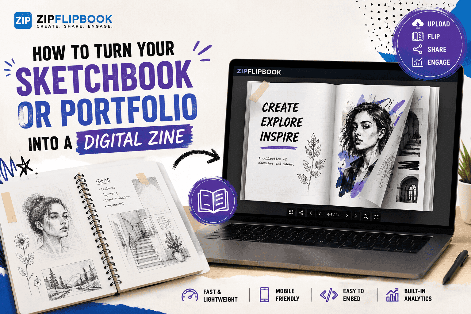
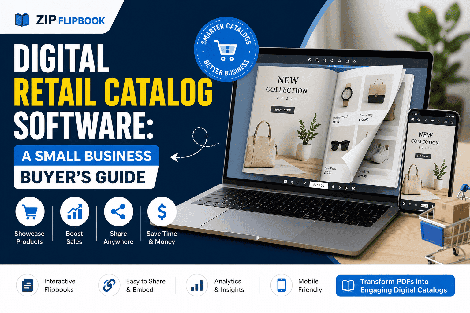
7. ZipFlipbook — Because Nobody Gets Excited About a PDF Link
I used to email PDFs and hope for the best. Attach, send, wait. Usually the response was silence, or a three-week delay, or "oh I haven't had a chance to open that yet."
Then I saw someone share a report that looked like a real magazine — page-turning, smooth, embedded right on a webpage. I clicked it immediately. Couldn't help it. It just looked like something worth reading.
So I took a client report I'd been sending as a PDF and uploaded it to ZipFlipbook. Free, no account needed, took about forty seconds. Got back a shareable link and an embed code. The next time I sent that report, engagement jumped. People were actually flipping through it, spending time on it, referencing specific pages in their replies.
That's not nothing. A PDF is a file. A flipbook feels like a publication. Same content, completely different perception.
Best for: Client reports, product catalogs, portfolios, digital magazines, any PDF you want to embed on a website instead of just linking. Cost: Free. No watermarks. No hidden upgrade wall.
Turn Your PDFs into Lead Generation Machines
Start getting highly-qualified leads from your PDFs and landing pages today. It takes exactly 2 minutes to set up.
No credit card required • Sign up in 10 seconds
How I Actually Put This Together
Last month, I used Apify to scrape around 3,400 Google Maps listings for a local services market analysis. Cleaned the data in Google Sheets, built a set of charts in Flourish, laid out the full report in Piktochart, exported to PDF, and published it as a flipbook on ZipFlipbook. Client had it embedded on their site within a day.
That whole pipeline, start to finish, cost me nothing except time. And most of the time was in the thinking — not the tools.
You don't need all seven of these. Pick the ones that match your actual problem. If you need data, start with Apify. If you need live dashboards, go Looker Studio. If you need to make a PDF feel worth reading, ZipFlipbook is the last step that ties it together.
And if you've got a PDF sitting on your desktop right now that you've been emailing as an attachment — go upload it. See what it looks like. It takes less than a minute.