My first zine was stapled together at a kitchen table with a glue stick that had gone hard at the edges. It was lopsided, the photocopier toner smudged across half a page, and I loved it more than almost anything I'd made before or since. There was nothing efficient about it. That was the point.
So when people ask me how to turn that same energy into something digital, my honest answer is: most of them are doing it wrong. Not because they lack design skill. Because they're trying to make a zine look clean, and a zine that looks clean stops being a zine. It becomes a brochure with attitude.
I built ZipFlipbook because I got tired of watching good content die inside flat PDFs and clunky embed tools. But this particular post isn't really a pitch for the platform, even though I'll show you where it fits. It's about what actually separates a zine from a document, and how you keep that feeling alive once you move from paper to screen.
What Makes a Zine Feel Like a Zine in the First Place
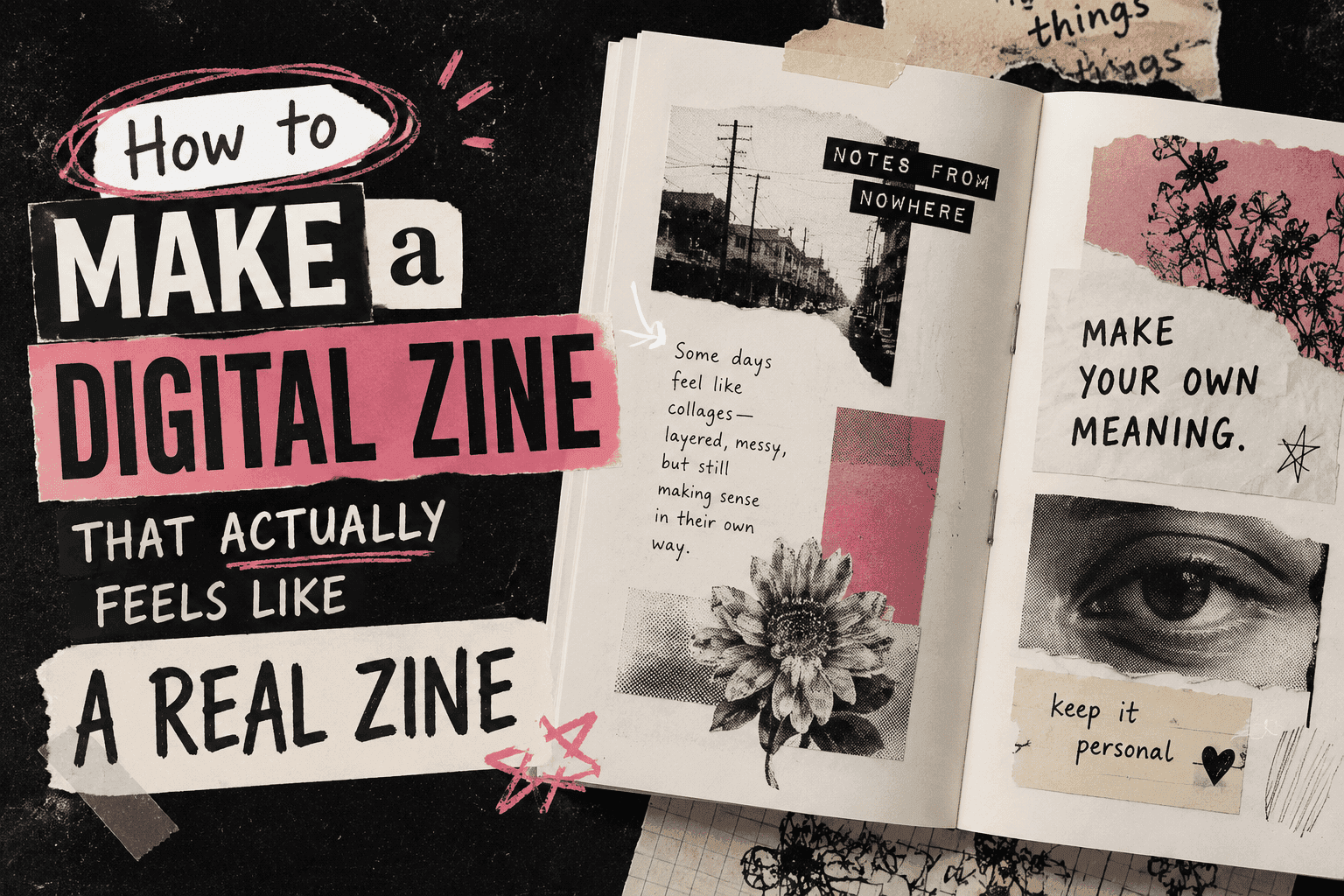
Strip away the cultural history for a second and ask what a zine physically is. It's cut paper, taped or stapled, photocopied cheaply, often by one person who didn't ask permission to have an opinion. The DIY-ness isn't decoration. It's the message. A zine says, "I made this myself, on purpose, without a committee."
That translates into specific visual habits people rarely name out loud:
Margins that don't match. Text that runs at an angle because someone glued it down crooked and didn't bother fixing it. Mixed fonts — a typewriter face next to hand lettering next to a magazine cutout. White space that isn't calculated, just left over. Photos with rough edges instead of crisp crops. A voice that sounds like one specific human being talking directly to you, not a brand calibrated by twelve stakeholders.
When digital zines fail, they fail because they sand all of this down. Someone opens Canva, picks a template, drops in a grid, and ends up with something that's technically a PDF about punk music but reads like a corporate newsletter. The content might be great. The container kills it.
Where the "Digital" Part Usually Goes Wrong
Off the top of my head, grids are the biggest offender — templates are a trap, plain and simple. If every image sits in its own perfect rectangle with even padding, congratulations, you've made a lookbook.
Then there's the reading experience. Scrolling a PDF isn't flipping a page, full stop. You end up pinching and zooming to read text that was sized for print, fighting the file instead of enjoying it. Part of what made the paper version satisfying was the physical act of turning a page — that small tactile payoff. Strip it out and something real goes missing, even if nobody can quite say why the digital version feels flat.
And honestly? Tone. This is the sneaky one. People nail the chaotic layout and then write like they're addressing shareholders. A zine's voice is supposed to be specific and a little unfiltered, like one person is talking to you and not a brand calibrated by twelve stakeholders. Scrappy layout, corporate sentences — the mismatch shows immediately.
Turn Your PDFs into Lead Generation Machines
Start getting highly-qualified leads from your PDFs and landing pages today. It takes exactly 2 minutes to set up.
No credit card required • Sign up in 10 seconds
Designing the Look Without Faking It
Here's where I'd actually start if I were building one from scratch.
Pick two or three fonts that genuinely clash and commit to them. Not five — that turns into noise instead of intention. A typewriter font for body text paired with something hand-drawn or stenciled for headers gets you most of the way there. Avoid anything that looks like it was chosen because it's "clean and modern." Clean and modern is the enemy here.
Let some pages look like a scrap pile and others look like a desert. The jarring switch is what keeps your brain awake — perfect grids put you to sleep. A uniform layout, even a stylish one, reads as designed-by-committee no matter how edgy the individual elements are.
Texture matters more than people expect. Scanned paper backgrounds, slightly rotated images, a torn-edge PNG behind a photo — these aren't gimmicks, they're doing the same job that actual paper and actual scissors used to do. You're recreating the evidence of hands having touched the thing.
And don't clean up your own voice too much. If you'd naturally write "okay this next part is going to sound dramatic but," leave it in. The slight roughness in the writing is doing as much work as the slight roughness in the layout.
Color is another place people overthink it. Old photocopied zines were basically black and white with the occasional risograph color bleeding through, so a digital zine that goes full saturated rainbow can end up looking like a kids' app instead of something underground. Pick a restrained palette — maybe one accent color against black and off-white — and let any "color" come through your images instead of your background fills. It keeps the thing feeling printed rather than rendered.
One more thing worth saying: don't be afraid of dead space that doesn't "do" anything. A whole page that's just one line of handwritten text in the middle of a lot of nothing is a zine move. It would never survive a corporate design review, which is exactly why it works here.
Making It Actually Work as a Digital Object
Here's where most digital zines actually fall apart, because nobody thinks about the file until the very end, and by then it's too late.
A digital zine needs to feel like something you flip through, not something you scroll. That sounds obvious but almost nobody builds for it. A static PDF uploaded to a Dropbox link is the digital equivalent of leaving your zine in a drawer. People click, glance at page one, and bail.
I got so sick of watching good layouts die in Dropbox that I built ZipFlipbook specifically to stop the pinching-and-zooming. Upload the same messy PDF you made — whatever wild, asymmetric, collaged thing came out of InDesign or Canva or even Google Slides — and it actually flips like paper instead of scrolling like a spreadsheet. No watermark forcing your readers to think about a tool instead of your content. It reads properly on a phone without anyone having to pinch-zoom into oblivion, which matters enormously for zines since most of yours will get shared and opened on a phone screen at 1am, which is honestly the most appropriate time to read a zine anyway.
You can drop it straight onto your own site or a Linktree-style page with an embed code, no separate app required, no login wall standing between your reader and page one. If you want to know who's actually reading it, there's basic analytics built in — which pages people linger on, where they drop off. And if your zine has a "subscribe for the next issue" angle, there's a lead capture option baked into the flipbook itself, so you're not relying on people remembering to come back.
None of that changes what your zine looks like. It just stops the format from undermining the work you put into the look.
Where you put it afterward matters too. Zine culture has always lived in specific corners — Reddit threads dedicated to self-publishing, small Discord servers, Are.na boards, the occasional table at a local zine fair that's gone half-digital now. Drop it in a Discord server where people actually talk to each other instead of just tweeting a link. If you just tweet a link, it's content. If you share it in a real space, it's a zine. There's a difference.
Turn Your PDFs into Lead Generation Machines
Start getting highly-qualified leads from your PDFs and landing pages today. It takes exactly 2 minutes to set up.
No credit card required • Sign up in 10 seconds
The Mistake That Undoes Everything Else
People get the visuals right and then publish it as a generic file-sharing link with a title like "Zine_Final_v3.pdf." That single decision tells your reader this is a leftover file, not a thing you made. Give it a real cover page that does its job as a cover — title, a little visual punch, maybe a tagline — because that's the first impression before anyone even starts flipping.
And resist the urge to over-polish on the second draft. I've watched people make a genuinely scrappy, alive first version and then "clean it up" before publishing, which usually means flattening exactly the qualities that made it interesting. If something looks intentional and a little rough, leave it rough.
Nail the voice and the flip, and you can mess up everything else. I've seen gorgeous zines flop and ugly ones get passed around for years. The ugly ones always win.
P.S. — yeah, Canva exports work fine, six pages counts, and the flipbook handles mobile better than a PDF ever will. Now go make something crooked.